18 Cool Concept Designs (Facelift) of Notable Websites
If the content is king, the design should be the queen. It’s a deadly crucial element to a website’s success, as it decides how content is to be structured and displayed, and bad design simply ruins the user experience, thus dooming the site traffic.
Often, we web designer has to play the trading game while we’re designing a website. We either trade beauty for functionality, or functionality for readability, as it’s impossible to produce a design that pleases everyone in every aspect.
So which design is better then? Web designers love to ask this question, and some even challenged themselves to play the trading game better by redesigning famous sites such as Facebook and YouTube, thus forming potential designs in this showcase post. Better or worse, you as a user decide it, enjoy!
According to its official statistic, Facebook has served more than 500 million active users, with 700 billion minutes spent on it. For this kind of statistic, it will be really stressful to design a web page for it. It might also be the same reason why so many designers challenged themselves to redesign Facebook. Let us take a view of several great attempts from designers below:
Concept design By: Barton Smith
“The Facebook Facelift is a self initiated project to challenge the form and functionality of Facebook. Its streamlined, structured, and linear interface is more comprehensible, enhancing the user experience and absorb-ability of content.”
Main Page. (Image Source: Barton Smith)

Photos Page. (Image Source: Barton Smith)

Events Page. (Image Source: Barton Smith)

Contacts Page. (Image Source: Barton Smith)

Notifications Page. (Image Source: Barton Smith)

Concept design By: Information Architects
This innovative design was born from December 2006 and later adapted to contemporary design standards, in order to have a fair comparison with Facebook’s current design. The idea was to create a mail-like application with interface that contains elastic 3 columns layout that clearly separates filter, information-stream, and reaction, which are clearly explained in their post.
Main Page. (Image Source: Information Architects)

Concept design By: Justin Dauer
“One of my primary goals was to move the interface toward more of a web app-type presentation. Facebook has around 175 million people who log in daily; all the repetitive tasks inherent in such usage are conducive to this form of approach. When I was wrapping this redesign up, Twitter’s new app-like UI launched, and gave me a moment of Stuart Smalley-like validation.”
Main Page. (Image Source: pseudoroom design)

Concept design By: Peter Knoll
A very sleek design by Peter Knoll. The graphic is greatly improved to make the entire site looks appealing and promising. The interface is also much more cleaner with nice typography applied for good readability.
Main Page. (Image Source: Peter Knoll)

Concept design By: AndasoloARTS
Facebook variation done by AndasoloARTS, it even gets sold! The color scheme is pretty similar to Peter Knoll’s design, but overall it’s a different design. Again a very sleek design with minimalism in mind.
Main Page. (Image Source: AndasoloARTS)

Concept design By: Jonaska
A design inspired from AndasoloARTS’ Facebook design, pretty unique too! I like the implementation of status sharing and search box, a well-designed variation indeed.
Main Page. (Image Source: Jonaska)

Concept design By: Czarny-Design
How about a sexy design with rounded corners elements? A completely unique design approach for Facebook with slightly altered color scheme, can you accept it?
Main Page. (Image Source: Czarny-Design)

Myspace
Once the behemoth of social networking, Myspace was ultimately overtaken by its main competitor, Facebook. Rebranded as My_____ now, it aims to become the leading social entertainment destination which includes music, movies, celebs, TV and games, powered by the passion of fans. Designs below were attempted for the old Myspace, but it’s still great to have a look on what designer thinks Myspace should be.
Concept design By: Rafael Oliveira
“What if Myspace had a more clear, defined and beautiful interface by default, but still with the option to personalize it, but in a more comprehensible way? That’s the question I made myself when starting this, and it came out to be a cool project. Besides the visual design, I proposed some usability improvements, based on content that is already on the site, and looking at their sitemap.”
Main Page. (Image Source: Rafael Oliveira)

Channels Menu. (Image Source: Rafael Oliveira)

Photos Page. (Image Source: Rafael Oliveira)

Customized Profile Page. (Image Source: Rafael Oliveira)

Artist Page. (Image Source: Rafael Oliveira)

Artist Page – Customized. (Image Source: Rafael Oliveira)

Videos Channel Page. (Image Source: Rafael Oliveira)

Processing over 1 billion search requests throughout the world, Google is the most famous website in the planet Earth. It’s also known as the kingdom that tries to dominate the internet by building user friendly products like Android, Gmail and Analytics. Since Google has lots of top-notch designers working on their website design, any redesign attempt is a direct challenge to their designers. Interesting.
Concept design By: Craig Reville
“Since Google have decided to perhaps re-design things a little I thought I’d have a go at how I want to see and use Google. I didn’t go wild on the icons or the logo mainly because icon designers could do a better job and I like the logo simple like that. Any and all feedback appreciated.”
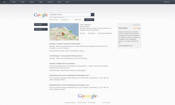
Main Page. (Image Source: Craig Reville)

Search Result Page. (Image Source: Craig Reville)
Search Result Page – 2nd Concept. (Image Source: Craig Reville)

Image Search Result Page. (Image Source: Craig Reville)

Concept design By: FloxDesign
A little bit like Bing, but in a more epic way. Sincerely I want to have this ultimately awesome design for my Google main page, please.
Main Page. (Image Source: FloxDesign)

YouTube
Ranked no.3 in global and no.4 in US site traffic, YouTube is a website to discover, watch, upload and share videos. Most content have been uploaded by individuals, but famous media like CBS, BBC, Vevo and Hulu have provided their own videos as part of the YouTube partnership program. Do you dare to redesign a site that’s being viewed more than 2 billion times a day? They did it.
Concept design By: Michele Byrne
A sleek redesign which emphasizes more about video viewing and sharing. Unique approach is applied to this design, though the user interface is a bit similar to Vimeo. Great attempt anyway.
Main Page. (Image Source: Michele Byrne)

Video Page. (Image Source: Michele Byrne)

User Page. (Image Source: Michele Byrne)

Video Info. (Image Source: Michele Byrne)

Recommended Video. (Image Source: Michele Byrne)

Concept design By: Josh Collie
“One of my biggest gripes with YouTube over the years has been the inability to search for other videos whilst watching video, as well as reading comments without having the video scrolling off the top of the screen. The design below attempts to solve this issue by having 3 separately scrollable columns including search, video & comments.”
Main Page. (Image Source: Josh Collie)

User Page. (Image Source: Josh Collie)

Concept design By: Thadeu Morgado
A redesign experiment for YouTube main page. The style is pretty much the same, except that the entire layout has been restructured, and a big, sleek slider is added to give more focus to featured videos.
Main Page. (Image Source: Thadeu Morgado)

Amazon
Amazon went online in 1995 and now it became the multinational e-commerce company which contains the biggest selection of books, magazines, music, DVDs, electronic, computer, software, shoes, virtually everything! Because they’re having such a huge business, designers worldwide have been challenging themselves on improving the design to make it even more beautiful and of course, user friendly.
Concept design By: Trevor Cleveland
“I wanted to explore three unique concepts for the redesign of Amazon’s homepage above the fold. Amazon is one of the leading on line shopping sites, but their fluid homepage design is set for monitor sizes with small dimensions, leaving the site to look very gappy on much newer computers with higher resolutions. So I wanted to present three ideas to bring Amazon up to speed.”
First Concept – Main Page. (Image Source: Trevor Cleveland)

First Concept – Menu. (Image Source: Trevor Cleveland)

Second Concept – Main Page. (Image Source: Trevor Cleveland)

Second Concept – Menu. (Image Source: Trevor Cleveland)

Third Concept – Main Page. (Image Source: Trevor Cleveland)

Third Concept – Menu. (Image Source: Trevor Cleveland)

Concept design By: Maurice Kindermann
There’s no redesign attempt if there’s no issue in the current design, Maurice Kindermann’s Amazon design is the best example for this case. Disappointed with Amazon’s current design, Maurice redesigned the page to solve three particular issues: over-extended screen resolution, fragmented buying option and flooded amount of content.
Main Page. (Image Source: Maurice Kindermann)

IMDb
Claimed itself as the biggest, best, most award-winning movie site on the planet, IMDb (Internet Movie Database) is an online database of information related to movies, television shows, actors, production crew personnel, video games and fictional characters featured in visual entertainment media. Redesigning this site in a way that it shows information effectively will be a great challenge for web designers.
Concept design By: Vladimir Kudinov
“Why don’t have the current IMDB design? It is overloaded. Large amount of unstructured information. While most users of such sites pay attention mainly to the pictures, videos and more.
So I did a clean and sleek design. Here, the user receives a screen on which there is information about the film: photos, actors, trailers, storyline and more. He does not have to twist, twirl, to read. All that is needed – is to look at the screen.”
Film Page. (Image Source: Vladimir Kudinov)

Menu. (Image Source: Vladimir Kudinov)

Player Pop Up Component. (Image Source: Vladimir Kudinov)

Top Panel. (Image Source: Vladimir Kudinov)

Concept design By: Rob Hendricks
“It’s not hard to see why the current IMDB website is so cluttered. The fact is they have A LOT of content. Proper information architecture was key in changing this.”
Main Page. (Image Source: Rob Atomic)

Foursquare
With Foursquare, users are able to share their current location by “checking in” via a smartphone application or SMS, bookmarking information about venues and leaving relevant suggestion about nearby venues. Local merchants also utilize the Foursquare to engage and retain their customers. Redesigning for Foursquare is really challenging as it’s a completely unique service so more studies are needed.
Concept design By: Clay Parker Jones
Clay Parker Jones believes that a map is a real nifty addition to Foursquare’s user page as the service is all about location. Clicking on the map would collapse the informative stats with 4 different views available. Other add-ons to this page are feeds, likes, tips and suggestions, pretty much like a usual social network page!
User Page. (Image Source: exitcreative)

Reflection
It doesn’t matter with the design, every user takes time to adapt the new design. The question is, as an user, do you wish to change to any of the design above, or you’re good with the current design? Do you think these design solve your user experience issue? I believe these design are made to receive your opinion, so feel free to share what you think about them, every opinion counts!