Build Websites Superfast with Foundation 5 [A Guide]
Using a frontend framework can improve your web design workflow in many ways. It can help you follow modern design principles such as mobile-first approach, semantic markup and responsive design. You can take leverage of many ready-to-use CSS and JavaScript elements and significantly speed up your development process, freeing up more time to focus on visual and user experience design.
Zurb Foundation 5 is one of the most powerful frontend frameworks out on the market. It’s logically built, easy-to-use and completely free. It lets you make use of a flexible CSS grid that facilitates in the creation of a clean, user-friendly layout. The Foundation framework is also heavily tested, so it takes care of cross-browser and cross-device compatibility.
In this tutorial I will show you how you can build a website superfast with Zurb Foundation 5. You can take a look at the final result on the demo page.
I will create the layout of the website, the task of adding subtle design elements is waiting for you. The website we will create together in this tutorial will accomplish the dream of the modern UX designer: it will be responsive, mobile-first, user-friendly, and semantic.
Due to the length of this guide, here are the shortcuts to get to the section you want quickly:
- Downloading Foundation 5
- Understanding the Grid
- Adding the Top Menu Bar
- Populating the Main Part
- Populating The Sidebar
- Conclusion
1. Downloading Foundation 5
You can download Foundation 5 in 4 different forms:
- the complete code
- a lighter version with only the essential code
- a custom version where you can customize what you need and what not
- a Sass version if you want to set your variables and mixins in SCSS.
In this tutorial I will choose the Complete code with vanilla CSS, but of course you can choose any other versions if you wish to streamline your site and only use what you really need.
After you have downloaded and unpacked the zip file, open the index.html file in your browser and you will see something like this:
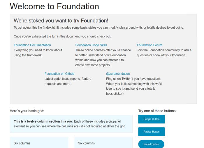
Yep, the devs included handy links in the index file. You can leave it this way and make a new file for your prototype with the name home.html or something similar, but you don’t really need to keep it as you can easily reach the Foundation Documentation whenever you want.
Open up the index.html file in your favorite code editor and delete everything inside the <body> section, but before the closing <script> tags.
Change the <title> tag in the <head> section to whatever title you want for your page, I will change it for “Foundation 5 Recipes”.
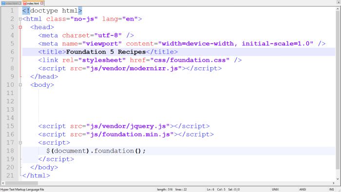
The demo will be populated with food-related content, and finally will look like this:

2. Understanding the Grid
By default, Foundation 5 divides the screen into rows and columns. Rows are marked with the CSS class “row” and columns are marked with the CSS class called “columns”.
All CSS selectors in Foundation have pretty straightforward names. Foundation 5 has 3 different grids:
- one for mobile screens: this is the Small Grid
- one for tablets: this is the Medium Grid
- one for desktops: this is the Large Grid.
The two breakpoints between the Small, Medium, and Large Grids are at 641px and 1025px screen width:
- the Small Grid rules between 0 and 640px
- the Medium Grid between 641 and 1024px
- the Large Grid rules above 1025px.
All these 3 grids consist of 12 parallel columns by default. Why 12? Because it can be divided by 2, 3, 4, and 6 therefore it allows many possible layout options
If you chose the “Custom Download” option in Step 1, you can opt for a different column number for more complicated layouts but for this example, we will use the default 12.
Our layout will be the following: on mobile and tablet sizes there will be one big column without a sidebar, and on desktop there will be a right sidebar. Below you can see the screenshot of the planned desktop layout populated with some Cupcake Ipsum dummy content.
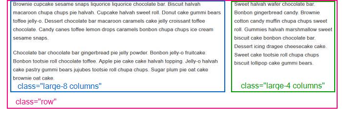
The most important thing you always have to remember is keeping the grid tidy.
First you always have to add a row. When you have created a row you have to add columns inside the row. The number of the columns needs to add up to 12. If there are more or fewer columns than 12, the grid won’t work.
In our desktop layout, I gave 8 columns to the main content on the left, and 4 columns to the sidebar on the right.
Let’s see how this looks like in code. First you can see the <div> with the “row” class. To divide the layout into two bars we need to put the whole page into a row. Later we can nest new rows into this, as rows and columns can be indefinitely nested in Foundation 5.
Inside every row you need to put columns that add up to 12. Columns are marked with the CSS class “columns” and the appropriate “large-n”, “medium-n” or “small-n” class.
<div class="row">
	<div class="large-8 columns">
		<p>Some content for the Main Div</p>
	</div>
	<aside class="large-4 columns">
		<p>Some content for the Sidebar</p>
	</aside>
</div>
When to Use the Large-n, Medium-n and Small-n classes
Now you surely ask why I only used the “large-8” and “large-4” classes and didn’t set anything for the Small and Medium Grids. If you remember, our planned layout only has a sidebar on desktop size which is represented by the Large Grid. On mobile and tablet it is just one wide column.
Foundation works the following way: you only have to set the smallest grid where you want to use a given layout.
It’s easier to understand this concept if you resize your browser window to test the code above. With this current code you can see that on mobile and tablet size the sidebar nicely slips under the main part.
Now change the “large-8” and “large-4” classes to “medium-8” and “medium-4”. You will experience that now the site has a sidebar both in tablet and desktop size but not on mobile. Remember that you always have to set the smallest grid you want to use the given layout on.
Just for the sake of fun now change the classes to “small-8” and “small-4”. Now the sidebar will appear on all layouts, even on mobile devices.
As Foundation 5 was created with the mobile-first web development approach in mind, you always have to design for the mobile screen. You need to do this because in the Foundation framework larger grids inherit the style rules of the smaller grids, but smaller grids don’t inherit from the larger ones.
So the Medium and Large Grid inherit from the Small Grid, and the Large Grid inherits from the Medium Grid but not the other way.

3. Adding the Top Menu Bar
In Step 3, we will add a Top Menu Bar to our site with a 2-level dropdown submenu. The top bar is not the part of the 2:1 desktop layout we created in Step 2, so you need to place the code snippet we will create here in Step 3 above the one we added in Step 2.
In the top menu bar on the left-hand side there will be the name of the site (“Foundation 5 Recipes”) with some menu items relating to the content and on the right-hand side we will put two utility menu items.
At the end of this step our site will look like this:
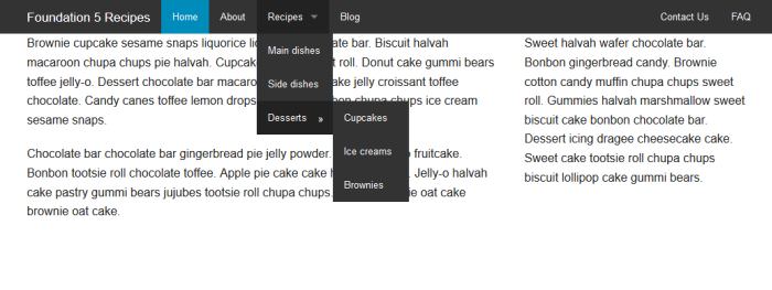
We will accomplish Step 3 by using Foundation 5’s Top Bar feature. To stay semantic we put the top menu bar inside a <header> tag.
The code is the variation of the one you can find inside the Docs. I didn’t change too much about it; I just added some content and varied the order of the list elements. The name of CSS-classes like “has-dropdown” and “dropdown” are pretty much self-explanatory. I also made the header sticky by adding two of Foundation’s Top Bar CSS classes: “contain-to-grid” and “sticky”.
<header class="contain-to-grid sticky">
    <nav class="top-bar" data-topbar role="navigation">
        <ul class="title-area">
            <li class="name"><h1><a href="#">Foundation 5 Recipes</a></h1></li>
            <li class="toggle-topbar menu-icon"><a href="#"><span>Menu</span></a></li>
        </ul>

        <section class="top-bar-section">
            <ul class="left">
                <li class="active"><a href="#">Home</a></li>
                <li><a href="#">About</a></li>
                <li class="has-dropdown"><a href="#">Recipes</a>
                    <ul class="dropdown">
                    <li><a href="#">Main dishes</a></li>
                        <li><a href="#">Side dishes</a></li>
                        <li class="has-dropdown"><a href="#">Desserts</a>
                            <ul class="dropdown">
                                <li><a href="#">Cupcakes</a></li>
                                <li><a href="#">Ice creams</a></li>
                                <li><a href="#">Brownies</a></li>
                            </ul>
                        </li>
                    </ul>
                </li>
                <li><a href="#">Blog</a><li>
            </ul>

            <ul class="right">
                <li><a href="#">Contact Us</a></li>
                <li><a href="#">FAQ</a></li>
            </ul>
        </section>
    </nav>
</header>
If you copy-pasted this snippet into your index file, take a quick peek on it on mobile size and check out how cool it looks.
4. Populating the Main Part
In Step 4 we will populate the main content section of our page. All the code snippets in this step need to be inserted inside the <div class=”large-8 columns”> column that we created in Step 2.
By the end of this step the looks of our demo site will improve a lot and will be similar to this:
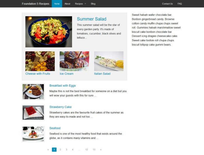
4.1 Adding a Panel for Popular Posts
First, we will add a “Popular” section (the light gray box in the screenshot above) that we will put inside a Foundation Panel.
In Step 4.1 we will create the one large post with the big picture and short description, in the demo it runs under the nickname “Summer Salad”, and in Step 4.2 we will add the 3 smaller popular posts with the smaller images below it.
We put the whole section inside the “panel” class which is Foundation 5’s pre-prepared CSS class. Inside the panel we place a new row , which will be our first nested row. On tablet and desktop size, this row will be divided to 50-50: one half of the row for the image and one half for the subtitle and the description.
On small screen, it would look awkward as the image would be tiny, so here we just want the text part to be under the image. As the smallest screen we want to set this 50-50 layout as the medium screen; we will use the “medium-6 columns” CSS selector for the columns.
We also added a custom CSS class called “popular-main” to the nested row. This is not Foundation 5’s class but ours. We put it there to make it easier to add our own style rules later. You can add as many of your own CSS selectors to your Foundation website as you want.
<div class="panel">
    <div class="row popular-main">
        <div class="medium-6 columns">
            <img src="img/summer-salad.jpg" alt="Summer Salad">
        </div>
        <div class="medium-6 columns">
            <h3><a href="#">Summer Salad</a></h3>
            <p>This summer salad will be the star of every garden party. It's made of tomatoes, cucumber, black olives and lettuce...</p>
        </div>
    </div>
<!-- Additional Popular Posts will come here in Step 4.2 -->
</div>
4.2 Adding 3 More Posts to the Popular Panel
We want to show the 3 additional posts only to tablet and desktop visitors, as 4 popular posts inside the Popular Panel would be too much distraction for people who will browse our site on small screens.
To achieve this goal we will make use of Foundation 5’s handy visibility classes. Foundation has many of them and their names such as “show-for-small-only” and “hide-for-large-up” clearly describe what they do.
Here we will choose the “show-for-medium-up” which will show the additional posts only on tablet and desktop size. Just like in Step 4.1, we will use the medium-n classes here too, as the smallest screen we want to show this layout is the tablet screen.
As this time we want to divide the row into 3 equal columns, we use the “medium-4 columns” CSS selector 3 times. We also add our own CSS class called “popular-additional” with the purpose of facilitating the custom styling later.
<div class="row popular-additional show-for-medium-up">
	<div class="medium-4 columns">
		<img src="img/cheese.jpg" alt="Cheese">
		<h4><a href="#">Cheese with Fruits</a></h4>
	</div>
	<div class="medium-4 columns">
		<img src="img/ice-cream.jpg" alt="Ice Cream">
		<h4><a href="#">Ice Cream</a></h4>
	</div>
	<div class="medium-4 columns">
		<img src="img/italian-salad.jpg" alt="Italian Salad">
		<h4><a href="#">Italian Salad</a></h4>
	</div>
</div>
4.3 Prettying Up the CSS
If you followed this tutorial by creating your own demo code you will see that our demo site has some layout flaws (see below), so it’s time to add some layout adjustments to our CSS.
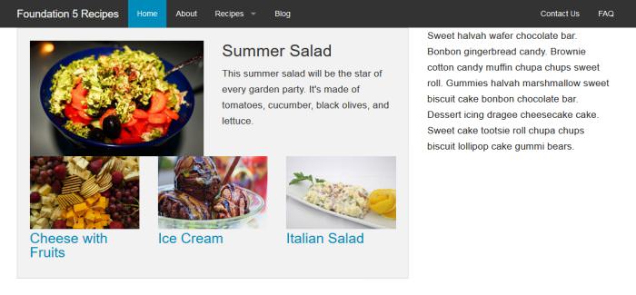
To add our own style we will create a custom CSS file called app.css (like how the Foundation Docs recommend it in the CSS Best Practices section).
Let’s open up the /css folder in our demo folder, create an empty text file and name it app.css. Finally open it up in a text editor.
Of course we also need to add the new custom CSS file to the <head> section of the index.html file below the foundation.css stylesheet. Now the <head> section of the index file looks like this:
<head>
 <meta charset="utf-8" />
 <meta name="viewport" content="width=device-width, initial-scale=1.0" />
 <title>Foundation 5 Recipes</title>
 <link rel="stylesheet" href="css/foundation.css" />
	<link rel="stylesheet" href="css/app.css" />
 <script src="js/vendor/modernizr.js"></script>
</head>
The style rules that we add to the app.css file to pretty up our prototype are these:
header {
	margin-bottom: 2em;
}
.popular-additional h4 {
	font-size: 1.125em;
	margin-top: 0.4em;
}
.row .row.popular-main {
	margin-bottom: 1.5em;
}
As Foundation 5 uses relative units, we need to use “em”-s or “rem”-s instead of pixels to keep up with the rules. (You can read about CSS units: Pixels vs ems vs % here.) I used Firefox’s Firebug extension to determine where I have to override Foundation 5’s CSS rules, you can use any other web development browser extensions if you want.
Here in this short CSS snippet we only had to override Foundation’s default CSS only once, at the last rule (.row .row.popular-main). Here’s what the demo site looks like now:
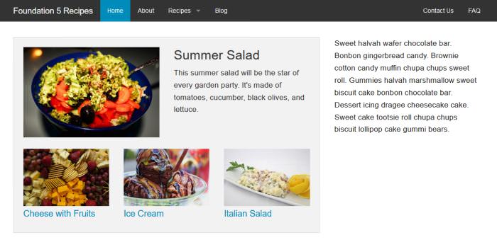
4.4 Adding Some More Content
Using the same rules as before we will add some more content to the main section of the page. The content that we will add now will be the Latest Posts with small thumbnails.
Foundation 5 has really cool pre-prepared thumbnail styles that we will make use of in this Step. Foundation Thumbnails use a pre-built CSS class called “th” that we need to add to the images we want to display as thumbnails in the way you can see it in the code snippet below.
For each Latest Post we add a new row below the Popular Panel with our custom CSS class called “latest-post”.
On tablet and desktop size we will show a small thumbnail using Foundation’s thumbnail class on the left, and the title and a short description on the right. On mobile, the headline and the description will go below the thumbnail.
Now I used the “medium-3 columns” and “medium-9 columns” classes to make them divide the screen into 1:3, 25% for the image and75% for the text up from medium size.
Insert the following code snippet below the Popular Panel three times (for the three Latest Posts). Here I just include the code of one Latest Post row, as all of them use the same HTML markup, only the content differs.
<div class="row latest-post">
    <div class="medium-3 columns">
        <a class="th" href="img/full-size-image.jpg">
        <img src="img/thumbnail-size-image.jpg" alt>
        </a>
    </div>
    <div class="medium-9 columns">
        <h4><a href="#">Title of Latest Post</a></h4>
        <p>Content of Latest Post... </p>
    </div>
</div>
Our custom CSS file created in Step 4.3, app.css also gets some new style rules to keep the looks of the demo tidy. Note: If you want to add your own custom CSS to Foundation, never forget to check, with a web dev tool, where you have to override the default rules.
In the CSS snippet below we need to override them in the first rule (.row .row.latest-post). In the second rule it’s enough to just use our own custom selector (.latest-post h4).
.row .row.latest-post {
	margin-bottom: 1.5em;
}
.latest-post h4 {
	margin-top: 0;
	font-size: 1.125em;
}
Our prototype now looks like this:
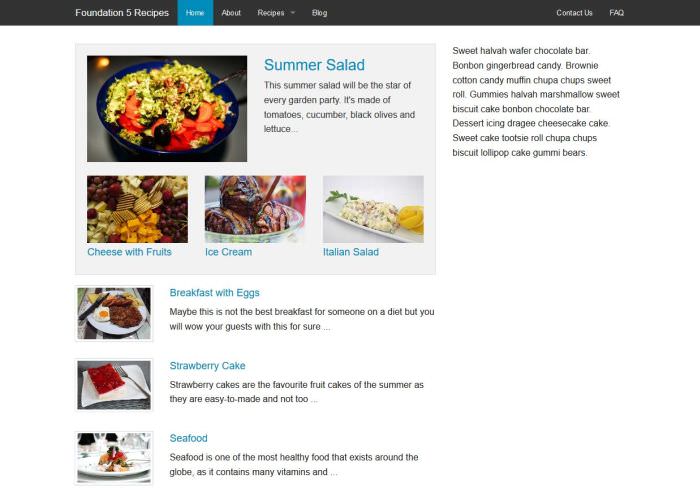
4.5 Adding Pagination
In this step we will add a cool pagination below the Latest Posts. Foundation 5 gives us a helping hand by its convenient, ready-to-use pagination classes. We use the same code in this step that you can find in the “Advanced” section inside the Pagination Docs.
<div class="pagination-centered">
    <ul class="pagination">
        <li class="arrow unavailable"><a href>«</a></li>
        <li class="current"><a href>1</a></li>
        <li><a href>2</a></li>
        <li><a href>3</a></li>
        <li><a href>4</a></li>
        <li class="unavailable"><a href>…</a></li>
        <li><a href>12</a></li>
        <li><a href>13</a></li>
        <li class="arrow"><a href>»</a></li>
    </ul>
</div>
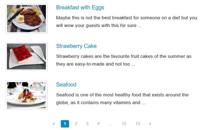
Here are the Latest Posts with the newly added Pagination section:
5. Populating the Sidebar
Now that we are ready with the main content of our demo site, it’s time to populate the right sidebar. The right sidebar will slip below the main content on mobile and tablet sizes.
You need to insert all the code snippets in this section inside the <aside class=”large-4 columns”> HTML tag that we set for the sidebar in Step 2.
The left sidebar will contain a Newsletter Sign Up Form (1), a Latest Video (2) and an accordion-style Sidebar Menu under the nickname “Our Cookbook” (3).
At the end of this step we will be ready with our demo that will look like this:

5.1 The Newsletter Form
To build a form in Foundation 5, you don’t have to do anything else, just place the grid inside a <form> HTML tag.
If you take a look at the code snippet below, you will see that we put the form in a row in which we set different CSS selectors for all the 3 grids: “small-12”, “medium-9”, and “large-12”.
We chose this solution because a 100% wide Newsletter Form looks cool on mobile size, but it’s really really awkward on tablet size as it becomes very wide. Luckily Foundation 5 lets us use “Incomplete Rows”: we just have to add the “end” class to the CSS class definition of the incomplete column.
So this is what’s going to happen here: on mobile size the sidebar will be displayed below the main content with a Newsletter Sign Up Form that covers the whole screen.
On medium size the sidebar will remain under the main content, but the Newsletter Form will just cover the 75% of the screen, and the remaining 25% will stay empty.
On desktop size the sidebar will be right next to the main content, and the Newsletter Form will cover the whole width of the sidebar again.
See the Grid Docs to read more about Incomplete Rows.
<div class="row">
    <div class="small-12 medium-9 large-12 columns end">
        <h5>Sign Up To Our Newsletter</h5>
        <form>
            <div class="row collapse">
                <div class="small-8 columns">
                	<input type="text" placeholder="your@ema.il">
                </div>
                <div class="small-4 columns">
                	<a href="#" class="button postfix">Send</a>
                </div>
            </div>
        </form>
    </div>
</div>
Now take a look inside the <form> tag in the code snippet above. We use Foundation’s built-in form system with the Postfix Button option (class=”button postfix”).
Foundation Forms have many other layout options such as Prefix Label, Prefix Radius Label, Postfix Button, and Postfix Label. We chose the Postfix Button option here as it’s more user-friendly: users can click on it and send the form at once.
Inside the form we will add a new nested row that divides the screen to 2:1. The text input will get 8 columns and the postfix button will get 4. As we want to have this layout even on mobile screen, we will set the “small-8 columns” and “small-4 columns” CSS-selectors here, the Small Grid being the smallest size where we want to implement this markup.
You can see another new thing in the HTML code above which is the “row collapse” class. This is Foundation 5’s built-in style. By default there is a gutter between two adjacent columns, but if we add the “collapse” class to our row, the gutter will disappear. We do this because we want the button to be right next to the text input without any space between them.
Now it’s time to insert this code snippet into the <aside> section of your HTML file.
5.2 Flex Video
Below the Newsletter Section we will add a Daily Video Recipe to our sidebar. Foundation 5 helps us make embedded videos responsive and force them to scale automatically with its Flex Video feature.
Flex Videos use the built-in “flex-video” CSS class. We create a new row for the Daily Video Recipe sidebar section and place one wide column in it with the “small-12 medium-9 large-12 columns end” CSS selectors for the same reason we used an incomplete row in the Medium Grid in the previous step.
Here is the code you need to paste below the Newsletter Section. You can use any video from Youtube, Vimeo etc.
<div class="row">
    <div class="small-12 medium-9 large-12 columns end">
            <h5>Daily Video Recipe</h5>
            <div class="flex-video">
                <iframe width="560" height="315" src="https://www.youtube.com/embed/PAtt_K3Tjjk"
                frameborder="0" allowfullscreen></iframe>
            </div>
    </div>
</div>
5.3 The Sidebar Menu
For the Sidebar Menu we will use the Accordion feature of Foundation 5. Accordions are web elements that expand and collapse the content into logical sections.
On our demo site these logical sections are the 3 different food groups (Main Dishes, Side Dishes, Desserts), and each group contains more smaller groups such as “Poultry”, “Pork”, “Beef”, “Vegetarian”.
We place the whole sidebar Accordion into one wide column with the same logic as in the 5.1 and 5.2 Steps before. We put the accordion inside it as an unordered list with the appropriate built-in CSS classes such as “accordion” and “accordion-navigation”.
As Foundation Accordions work with JavaScript, you can customize its behavior with the help of pre-built JavaScript variables if you want. To do so, look at the “Optional JavaScript Configuration” section in the Accordion Docs. The following code snippet comes below the Flex Video section inside the index.html file.
<div class="row">
    <div class="small-12 medium-9 large-12 columns end">
        <h5>Our Cookbook</h5>
        <ul class="accordion" data-accordion>
            <li class="accordion-navigation">
                <a href="#panel1a">Main dishes</a>
                <div id="panel1a" class="content active">
                    <ul>
                        <li><a href="#">Poultry</a></li>
                        <li><a href="#">Pork</a></li>
                        <li><a href="#">Beef</a></li>
                        <li><a href="#">Vegetarian</a></li>
                    </ul>
                </div>
            </li>
            <li class="accordion-navigation">
                <a href="#panel2a">Side dishes</a>
                <div id="panel2a" class="content">
                    <ul>
                        <li><a href="#">Potato dishes</a></li>
                        <li><a href="#">Vegetables</a></li>
                        <li><a href="#">Salads</a></li>
                        <li><a href="#">Rice recipes</a></li>
                    </ul>
                </div>
            </li>
            <li class="accordion-navigation">
                <a href="#panel3a">Desserts</a>
                <div id="panel3a" class="content">
                    <ul>
                        <li><a href="#">Fruit cakes</a></li>
                        <li><a href="#">Brownies</a></li>
                        <li><a href="#">Ice creams</a></li>
                        <li><a href="#">Pies</a></li>
                    </ul>
                </div>
            </li>
        </ul>
    </div>
</div>
Conclusion
Now that we are ready with our demo site, let’s see what else you can accomplish with Foundation 5. The elements we used in this demo are just a small set of the features of the Foundation framework. There are many other things you can make use of in your design, such as customizable Icon Bars, Breadcrumbs, Lightboxes, Range Sliders, Form Validation, and many others. The Docs are pretty well-written and they help developers with many code examples.
If you are familiar with Sass you have even more options as each section in the Docs explains how you can build your own mixins, and which Sass-variables you can use to customize your site. Before you start to design your webpage don’t forget to check the compatibility of the Foundation framework to make sure it works on all browsers you need to build for.